 Skip to content
Rebranded and Redesigned: Introducing the New Blackinkk

Blackinkk was founded in 2015 with the intention of making everyday carry goods that help you do better. With that came minimalist wallets, carefully crafted by artisans from sustainable kangaroo leather.
We set ourselves apart using a design process with multiple iterations inspired by feedback from our loyal followers. However, as Blackinkk continues to grow, we realised there was one area yet to have the focus it deserved...
That's why today we're excited to announce our rebranding — a sign of what’s to come for Blackinkk!
HISTORY AND VALUES
Blackinkk has always been about sustainability, simplicity, and quality. Born out of a love for well-designed and well-made products, our products took inspiration from design leaders and began with our Two Pocket Cardholder. Along this creative journey, our principles remained the same and we continued to pursue new designs and products that lived up to them.
Founder and designer Varun, embodies this legacy. In his words, "I always strive for things to be sustainable. By that, I mean the development of long-lasting products, products that don’t age prematurely, which won’t become out of style. Products that will remain neutral, that you can live with longer."
Now that we're 6 years deep into this journey, we wanted to revisit our branding and create a design that reflects these values in a contemporary way.

STATE REDESIGNED LOGO + COLOURS
Rebranding can be a rollercoaster. We wanted a design that honoured Blackinkk's heritage yet felt modern. Fortunately, we found a way.
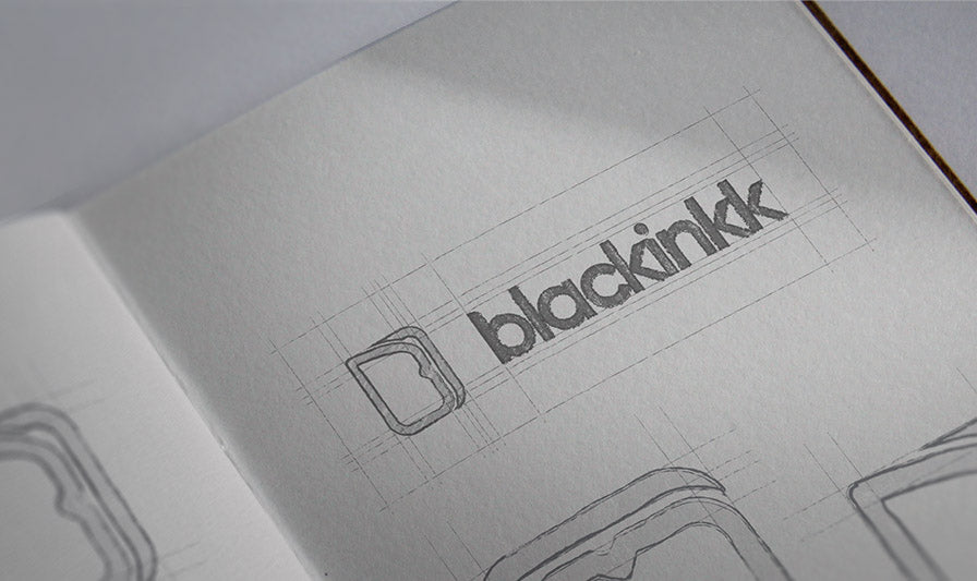
To honour the past, the concept took notes from the Two Pocket Cardholder. As one of the original and most distinguishable Blackinkk products, the silhouette of the Two Pocket was incorporated into the icon. Its smooth front curved conveyed a subtle B whilst the back lines form half of a serif I, creating an abbreviation of Blackinkk concealed in the form of an emblem. The unique curvature is then used in the logotype, found in the lowercase B and I.

When it comes to colour, the palette focuses on neutral and earthy tones. Graphite grey is the primary colour chosen for being one of our most popular product colours. The secondary, tertiary and contrast colours compliment it and the contrast is based on the latest lineup of colours from the Two Pocket collection. Black and white are also additional colours used for their timeless simplicity and reflection of our name.
Overall the minimalism shines through, with nuanced adjustments for individuality.
NATURAL PROGRESSION
Why now? Honestly, it felt like a natural progression — the time had come for us to see Blackinkk take a new form. Our logo no longer represented who we were as a brand and deserved a redesign.
What started from humble beginnings as a leather goods store at the Brisbane Finders Keepers Market has grown into a lifestyle brand with a collection of products and thought-provoking content.
This is the next chapter.

LOOKING TOWARDS THE FUTURE
Blackinkk is constantly evolving but our values of sustainability, simplicity, and quality continue to guide us.
We'll continue to hone our practices and innovate new products that benefit their environment — with both a global and individual impact.
That's all we can say for now. For those who have been with us since the beginning, thank you.
If this is you discovering us, welcome.

STAY ON THE JOURNEY
Follow us along the next exciting steps of our journey. Signup to our newsletter to see "Do Better" insights from our notebook as well as new products and deals first that will keep you looking fresh.
Follow us on Instagram and Facebook. Shop our latest collection now.
